
Welcome to a new publication of the Market’s Compass Developed Markets Country (DMC) ETF Study. It continues to highlight the technical changes of the 22 DMC ETFs that we track on a weekly basis and share our technical opinion on, every three weeks. There are three ETF Studies that include the Market’s Compass US Index and Sector (USIS) ETF Study, the Developed Markets Country (DMC) ETF Study and the Emerging Markets Country (EMC) ETF Study. The three Studies will individually be published every three weeks and sent to paid subscriber’s email. An excerpt will be sent to free subscribers. The EMC ETF Study will be published next week.
This Week’s and 8 Week Trailing Technical Rankings of the 22 Individual ETFs
The Excel spreadsheet below indicates the weekly change in the objective Technical Ranking (“TR”) of each individual ETF. The technical ranking or scoring system is an entirely quantitative approach that utilizes multiple technical considerations that include but are not limited to trend, momentum, measurements of accumulation/distribution and relative strength. If an individual ETFs technical condition improves the Technical Ranking (“TR”) rises and conversely if the technical condition continues to deteriorate the “TR” falls. The “TR” of each individual ETF ranges from 0 to 50. The primary take-away from this spread sheet should be the trend of the individual “TRs” either the continued improvement or deterioration, as well as a change in direction. Secondarily a very low ranking can signal an oversold condition and conversely a continued very high number can be viewed as an overbought condition but with due warning over sold conditions can continue at apace and overbought securities that have exhibited extraordinary momentum can easily become more overbought. A sustained trend change needs to unfold in the individual TR for it to be actionable.
The steady improvement in individual TRs (as well as the Total ETF Ranking) since the Market’s Compass Developed Markets Country ETF Study that I published on February 20th (Publication #429) for the week ending February 17th, can be seen at a glance in the spread sheet above. This is allowed by the “heat map” characteristics of the spread sheet.
The broad based improvement in individual TRs since the week ending March 17th, can be seen at a glance in the spread sheet below with all TRs gaining ground, the iShares MSCI United Kingdom Index Fund ETF (EWU) gained the most over the past three weeks by rising +24.5 “handles” to 43 from 18.5. That gain was followed by the iShares MSCI Belgium Index Fund ETF (EWK) which jumped by +20.5 to 43 from 22.5 and the iShares MSCI Spain Index Fund ETF (EWP) which rose +20 to 46 from 26. The average TR gain over the past three weeks was +14.65.

As can be seen below at the end of last week there fourteen ETF TRs in the “green zone”, six ETFs were in the “blue zone” (15.5 to 34.5) and two were in the “red zone” (0 to 15). This was versus the week before when thirteen ETFs had TRs in the “green zone”, 7 were in the “blue zone” and two were in the “red zone”. The same two ETF were in the “red zone” two weeks in a row. The Global X FTSE Norway 30 ETF (NORW) fell -2 “handles” to 11.5 from 13.5 and the iShares MSCI Israel ETF (EIS) fell -4.5 to 10.5 from 15. The WoW average TR gain was +1.52

The Technical Condition Factor changes over the past week and previous 8 weeks

There are eight Technical Condition Factors (“TCFs”) that determine individual TR scores (0-50). Each of these 8, ask objective technical questions (see the spreadsheet posted above). If a technical question is positive an additional point is added to the individual TR. Conversely if the technical question is negative, it receives a “0”. A few TCFs carry more weight than the others such as the Weekly Trend Factor and the Weekly Momentum Factor in compiling each individual TR of each of the 22 ETFs. Because of that, the excel sheet above calculates each factor’s weekly reading as a percent of the possible total. For example, there are 7 considerations (or questions) in the Daily Momentum Technical Condition Factor (“DMTCF”) of the 22 ETFs (or 7 X 22) for a possible range of 0-154 if all 22 ETFs had fulfilled the DMTCF criteria the reading would be 154 or 100%.
This past week a 80.52% reading in the DMTCF was registered for the week ending April 7th, or 124 of a possible total of 154 positive points. When we last published the DMTCF reading has just recovered from a deeply oversold reading of 0.65% or 1 out of 154 positive points from the week ending February 24th. It had since risen to 91.56% two weeks ago leaving the DMTCF in the overbought range between 85% and 100% before last week’s pullback to 80.52%.
As a confirmation tool, if all eight TCFs improve on a week over week basis, more of the 22 ETFs are improving internally on a technical basis, confirming a broader market move higher (think of an advance/decline calculation). Conversely, if more of the 22 TCFs fall on a week over week basis, more of the ETFs are deteriorating on a technical basis confirming the broader market move lower. Last week 5 TCFs rose, two fell and one was unchanged.
The URTH with This Week’s Total ETF Ranking “TER” Overlaid
The Total Technical ETF Ranking (“TER”) Indicator is a total of all 22 ETF rankings and can be looked at as a confirmation/divergence indicator as well as an overbought oversold indicator. As a confirmation/divergence tool: If the broader market as measured by the iShares MSCI World Index ETF (URTH) continues to rally without a commensurate move or higher move in the TER the continued rally in the URTH becomes increasingly in jeopardy. Conversely, if the URTH continues to print lower lows and there is little change or a building improvement in the TER a positive divergence is registered. This is, in a fashion, is like a traditional A/D Line. As an overbought/oversold indicator: The closer the TER gets to the 1100 level (all 22 ETFs having a TR of 50) “things can’t get much better technically” and a growing number individual ETFs have become “stretched” the more of a chance of a pullback in the URTH. On the flip side the closer to an extreme low “things can’t get much worse technically” and a growing number of ETFs are “washed out technically” an oversold rally or measurable low is close to be in place. The 13-week exponential moving average in Red smooths the volatile TER readings and analytically is a better indicator of trend.

As was seen earlier in this Blog there has been a steady improvement in the TER since it reached a low at 455 at the end of the week, March 17th. The URTH closed out last week just shy of -0.50 points of the February 3rd weekly closing high at 118.17. If the ETF is able to print a weekly close above that level I will to see a commiserate move to a new weekly closing high in the TER (above 875) to declare a confirmation of the price move. That said, if there is a move above above that level will place the TER in the area of “overbought territory”. The 13-Week Moving Average of the TER (red line) had started to hook higher but has stalled giving nary a hint at future trend.
The Average Technical Ranking of the 30 US Index and Sector ETFs
The weekly Average Technical Ranking (“ATR”) is the average Technical Ranking of the 22 Developed Markets Country ETFs we track. Like the TER, it is a confirmation/divergence or overbought/oversold indicator. It is charted in the panel below the Weekly candle chart below.
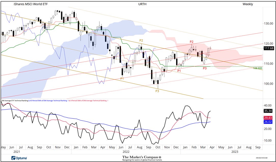
When I last published the DMC ETF Study on March 20th for the week ending March 17th, I brought attention to the price break that violated support at the previous overtaken resistance at the Upper Parallel (solid gold line) of the longer-term Schiff Pitchfork (gold P1 through P3). My concern at the time was that there would be follow through to that nasty week and that the Kijun Plot would be in jeopardy of being broken but a price pivot developed above that level and two weeks later the ground above that Upper Parallel was retaken. That price pivot was the genesis of the new short-term Standard Pitchfork (red P1 through P3) whose Median Line (red dotted line) was promptly overtaken, but prices stalled at the top of the Cloud last week, marking the second time this year that the Upper Span of the Cloud capped prices this time with a classic Doji candlestick pattern, signaling market participants temporary indecision.
One technical concern is that even though the ATR remains above both its shorter and longer term moving averages the indicator at 35.34 is more than 11% below the recent January higher high at 39.77. This while the URTH closed last week at a nominal higher high suggesting a budding non-confirmation. More on my thoughts of the short-term technical condition of the URTH later in the Blog, but first…
The Weekly Absolute and Relative Price % Change*
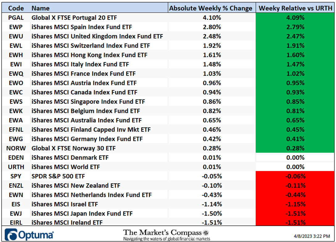
*Does not include dividends
Fifteen of the Developed Markets Country ETFs we track in these pages were up on an absolute basis last week. The average absolute gain of all 22 ETFs was +0.70% versus a +0.01% gain in the URTH. Because of the de minimis gain in the URTH the 15 ETFs that outperformed on absolute basis also outperformed on a relative basis. On an absolute basis the Global X FTSE Portugal 20 ETF (PGAL) was at the top of the “pack” gaining +4.10% followed by its geographic neighbor the iShares MSCI Spain Index Fund ETF (EWP) which gained 2.80%.
Thoughts on the short-term technical condition of the URTH*

*Of interest to scalpers, traders, and technicians
A week ago last Wednesday the URTH overtook the Median Line (dotted red line) of the newly drawn Schiff Modified Pitchfork (red P1 through P3). The following day it overtook the Upper Parallel (solid purple line) of the longer term Standard Pitchfork (purple P1 through P3). Last Friday prices accelerated higher but for all intents and purposes failed at the Upper Parallel of the shorter-term Pitchfork during the holiday shortened trading week.
As can be seen by the overbought level reached by the DM Country ETF Daily Momentum Oscillator (lower panel) there was not enough upside “momentum fuel in the tank” left to overtake the Upper Parallel and unsurprisingly during the backing and filling that followed upside momentum slowed as witnessed by MACD. Despite Thursday’s bounce at the Median Line (red dotted line) I do not think that the current short term consolidation/ retracement has run its course. Further technical evidence that this likely the case can be seen by looking at the RRG chart that follows…

The Relative Rotation Graph, commonly referred to as RRGs were developed in 2004-2005 by Julius de Kempenaer. These charts are a unique visualization tool for relative strength analysis. Chartists can use RRGs to analyze the relative strength trends of several securities against a common benchmark, (in this case the URTH) and against each other over any given time period (in the case above weekly since the middle of March. The power of RRG is its ability to plot relative performance on one graph and show true rotation. We know that there is rotation between Country ETFs driven by many factors including but not limited to underlying currency movements, individual country economic fundamentals, and political climates, but trying to visualize that “rotation” on linear charts is nearly impossible. All RRGs charts use four quadrants to define the four phases of a relative trend. The Optuma RRG charts uses, From Leading (in green) to Weakening (in yellow) to Lagging (in pink) to Improving (in blue) and back to Leading (in green). True rotations can be seen as securities move from one quadrant to the other over time. This is only a brief explanation of how to interpret RRG charts. For those who have an interest and want to learn more, Mathew Verdouw at Optuma has two video tutorials that delve deeper into RRGs. I urge my Blog readers to avail themselves of these. The links to those videos are posted at the end of this Blog.
Although there are a few of the ETFs we track in these pages are beginning to turn and some whose descent are slowing the majority of DMC ETFs are tracking lower in the Weakening Quadrant. The only one that is continuing to grudgingly try to improve is the SPY. This should add credence to the thesis that more short term consolidation and price retracement in the DMC ETFs is in the cards.

The iShares MSCI Spain Index Fund ETF has taken the pole position YTD relative to the URTH which is up +7.72% YTD, The EWP is up +10.77% YTD on a relative basis from up+ 4.50% when we last published. The iShares MSCI Ireland ETF (EIRL) has slipped on a relative basis into the number two spot to being up +10.52% from +10.94% since we last published on March 20th for the week ending March 17th.
Charts are courtesy of Optuma whose charting software enables anyone to visualize any data including RRG Charts and our Objective Technical Rankings.
The following links are an introduction and an in depth tutorial on RRG Charts…
https://www.optuma.com/videos/introduction-to-rrg/
https://www.optuma.com/videos/optuma-webinar-2-rrgs/
To receive a 30-day trial of Optuma charting software go to…
Source link
#Markets #Compass #Developed #Markets #Country #ETF #Study